Improving a dashboard serving 1M+ residents.
CABB operates the SCADA system that runs a regional water utility's pumps, valves, and treatment process. The interface was slowing down decisions operators needed to make fast, so I redesigned it around how the work actually happens.
At a glance.
Six months. One designer. Usability issues users had raised for years, solved.
Satisfaction
Reported by operators in the post-launch survey, against the same task set they'd run for years.
Onboarding
New operators reached competence faster, measured from first shift to unsupervised operation.
Reach
The system the redesigned dashboard runs supplies water across the utility's full coverage area.
Situation
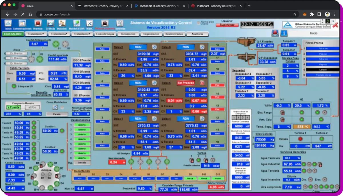
- CABB was modernising their SCADA system, the control dashboard plant operators use to monitor and control the water network for a regional utility.
- I arrived when the project was already late, and I found a real misalignment: two groups that
needed different things from the same screens.
- Operations, watching the network in real time. They had been raising usability issues for years.
The new platform was the chance to fix them.
- Confusing layout and inconsistent hierarchy.
- Visual feedback that didn't match what the system was actually doing.
- Management, needing to make decisions based on data the dashboard wasn't giving them.
- Operations, watching the network in real time. They had been raising usability issues for years.
The new platform was the chance to fix them.
- Under all of it, an onboarding gap: every new hire was being trained around the interface, not by it.
- No metrics were being tracked, so there was no way to measure success or improvement.
Task
- Only designer on the project, working alongside the decision makers and the
integration team.
- Align stakeholders.
- Define the project goals.
- Understand the operators.
- Redesign the interface.
- Leave behind a design system the team could keep building on.
- Short timeline: alignment then research then validation then implementation.
Actions
- Alignment meeting: 1st Design Thinking workshop to align all stakeholders.
- Decided to focus on operations.
- Agreed on key metrics: User satisfaction & Onboarding time.
- Reduced the initial delivery scope: A desktop web app.
- As my main user was the operator, it was hard to get them to have user interviews in a meeting room.
So I had to go to them.
- Site visit. Walked the plant and mapped the operational process end to end, marking the moments where the interface was getting in the way.
- 2nd Design Thinking workshop. Operators, managers and engineers in one room, to surface needs and co-create the directions worth testing.
- Shadowing. Spent shifts with operators in their actual environment, watching the small adaptations they'd built up around the old interface.
- Ran a weekly feedback cadence with stakeholders (mandatory for decision makers). Early validation, fewer expensive surprises.
- Four moves in the redesign, none of them flashy, all of them load-bearing for an operator on shift.
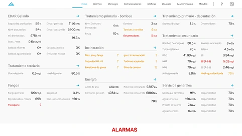
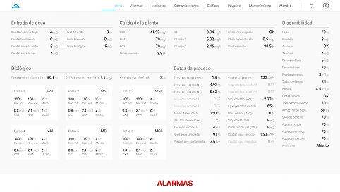
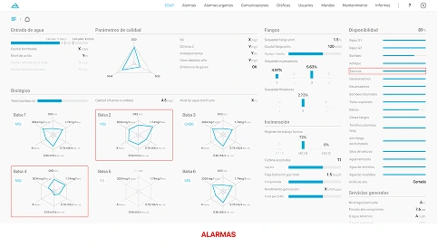
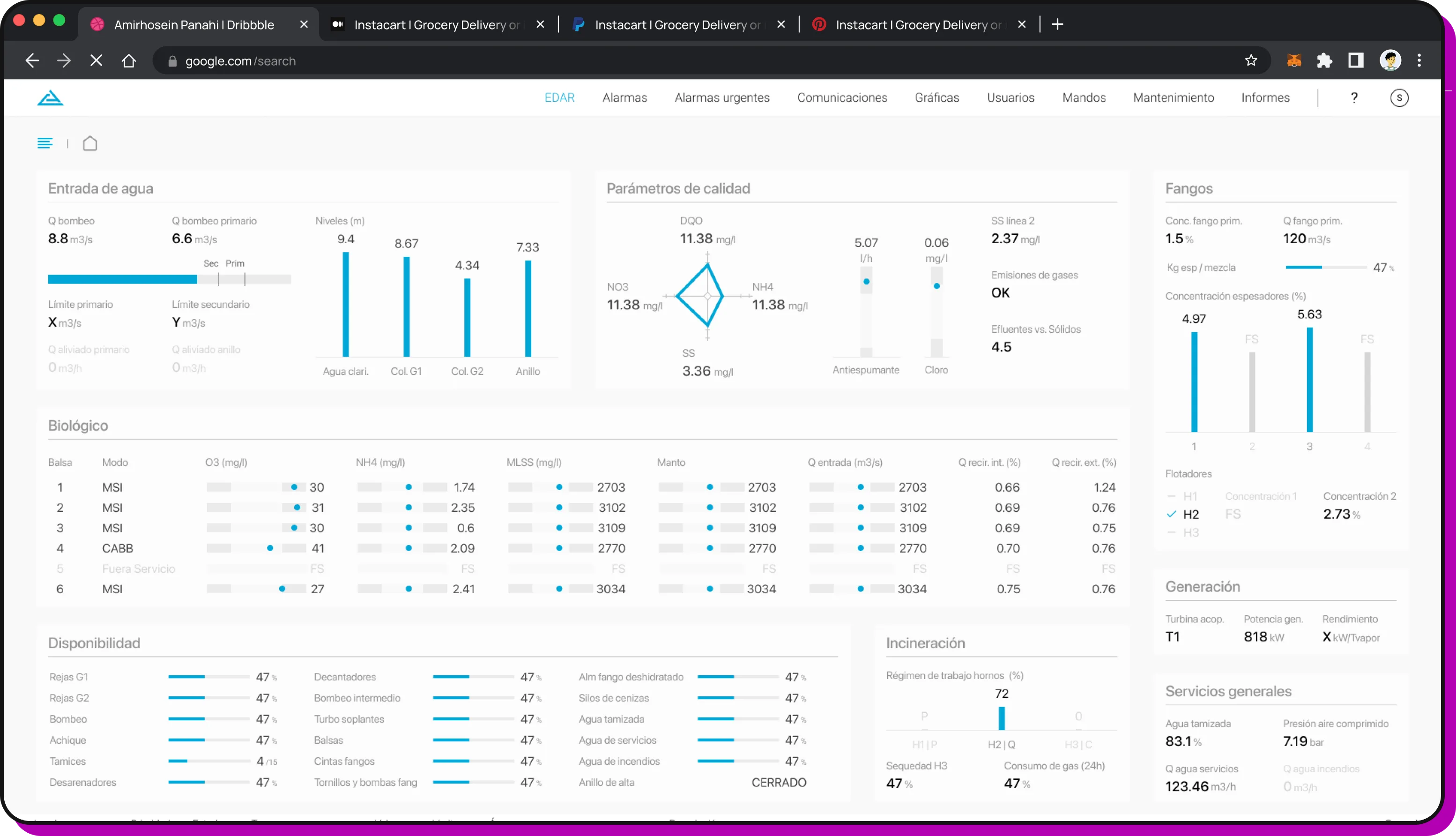
- Clear navigation. Restructured the IA with logical grouping and unambiguous labels, so operators found things where they expected them.
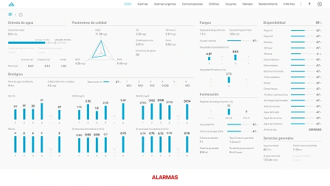
- Better data visualisation. Charts and indicators that communicate state, with colour and contrast serving the meaning rather than decorating it.
- Less cognitive load. Contextual information surfaced at the right time, instead of hunting through screens to confirm what's happening.
- Error prevention. Confirmation patterns and validation around critical actions, so mistakes get caught before they become incidents.
- Tested an iteration of the dashboard every week with the head of operations (previous operator) before the design was locked. Every round cut a confusion the last one had revealed.
- Ran a before-and-after satisfaction survey with operators, where they rated the dashboard on a scale of 1 to 10.
Results
The company never tracked metrics on the old system. The before-and-after survey did.
- +30% user satisfaction, reported by operators against the same task set they'd run for years.
- −20% time-to-confidence for new operators, measured from first shift to unsupervised operation.
- Clear hierarchy and consistent navigation cut the small confusions that used to compound into real operational errors.
- Operators could read the state of the system at a glance, instead of triangulating between three screens to confirm it.
- The design system and UI kit outlived me on the project.
- The team kept building after I rolled off, without needing a designer in the room to hold the standard.
What went wrong
Six months wasn't enough time to solve everything. Two things I'd fix with more runway:
- No dark mode. I only realized operators worked day and night shifts after the interface was already built, and dark mode would have helped on night rotations.
- Contrast (accessibility) issues.On some screen resolutions and colour profiles, the grey background lost enough contrast to make certain indicators hard to read.
When people can’t quit your product, bad design doesn’t show up as churn. It shows up as training time and mistakes nobody logs. If that’s the software you’re building, let’s talk.
Let’s talk